Communication design
The fine art
Visual perception is of particular importance to humans. The metaphor “A picture is worth a thousand words” illustrates that often complicated issues can be explained in an understandable way with just one picture or illustration and thus have a stronger impression on the viewer than a detailed text.
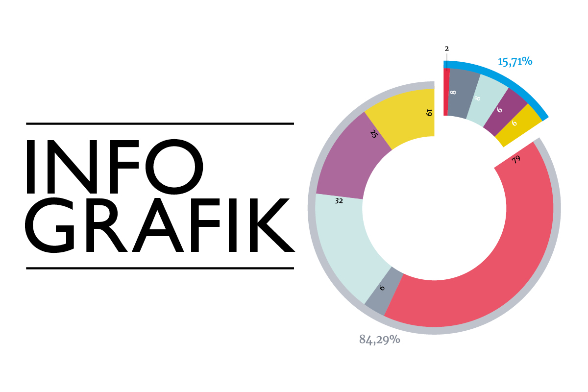
An information graphic provides a visual representation of the overall context in just a single illustration.
Information graphics
Information graphics consist of diagrams such as bars, column charts, curve charts or pie charts, and maps, plans or time sequences can also be displayed. Through the pictorial preparation, facts can be effectively conveyed, information can be made clear in an uncomplicated manner and comparisons can be made vividly.
Excellent graphic design is characterized by the fact that facts and contexts can be grasped intuitively. The graphic implementation requires a high degree of skill in order to visually prepare the broad spectrum of complex data, factual information, facts, proportions, structural setups, processes, etc. as comprehensibly and as easily as possible.
Thanks at this point to our talented graphic designer Magdalena, who created these graphics for our client the German Federal Ministry for Economic Affairs and Energy with full commitment. [Atlas of the Industrialization of the New Federal States in Germany].
@Magdalena (Graphic Designer iService)
How do you build an infographic?
“The most exciting and also difficult part is definitely at the very beginning, because here it’s about understanding the data that you are supposed to prepare visually as a graphic designer. That means you have to deal with countless different analyses and components – as in this case – in order to be able to work out the core messages in the next step.
Only when the core messages have been crystallized can one think about a visual implementation: Which implementation is best suited for which data? Pie chart, bar chart or another visual form? Which type of representation most clearly conveys the information? How many levels should the graphic include?
Only after these basic questions have been answered can the actual design begin. Here, too, many other decisions have to be made: Color scheme, representation of lines, fonts, shapes, spacing, etc. On top of that, there are very personal design ideas that might make a piece of content look even better and more visual.
All of this together is a challenging task that may sound dry to some: putting sober data into a visually understandable form. But for me, it means a high degree of exciting & versatile creative freedom.”


