
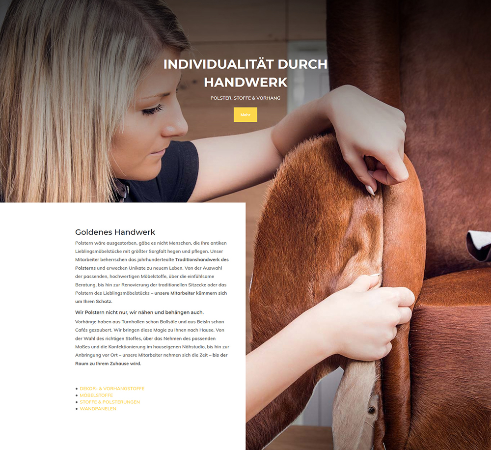
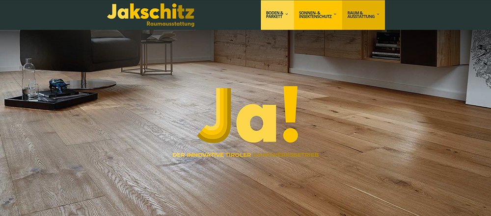
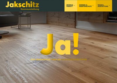
With the relaunch of the website https://www.jakschitz.at/, we have realized for the renowned Tyrolean company Jakschitz a promotional appearance with a website in responsive webdesign. Aesthetically and atmospherically, information and content areas with a precise target group approach flow into a harmonious overall impression.
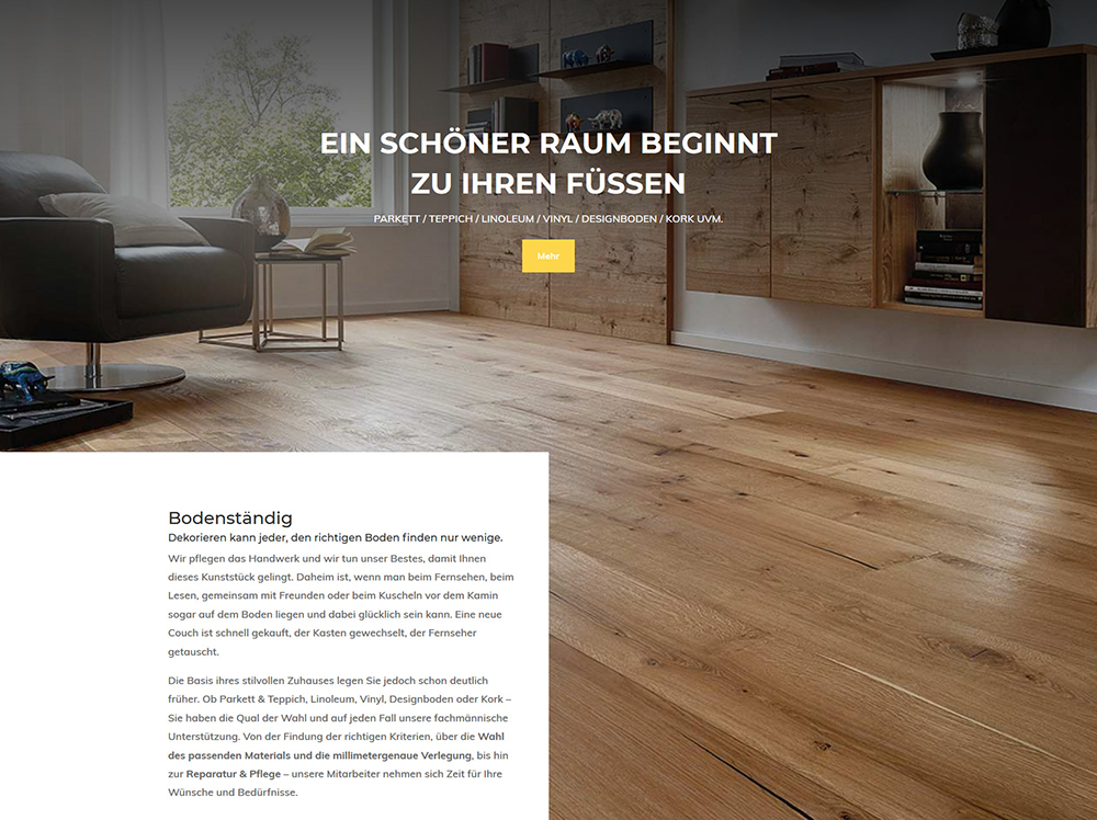
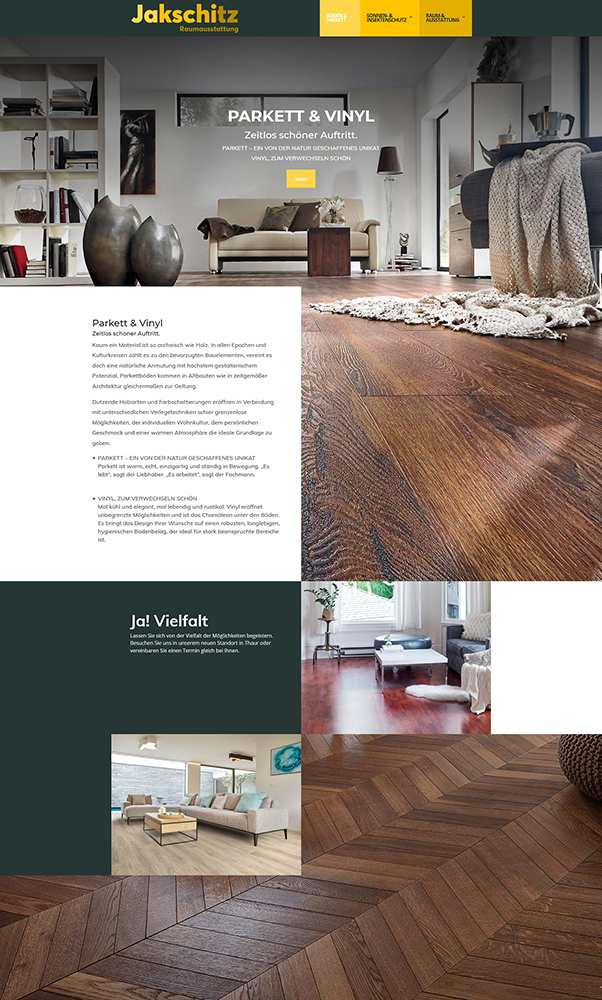
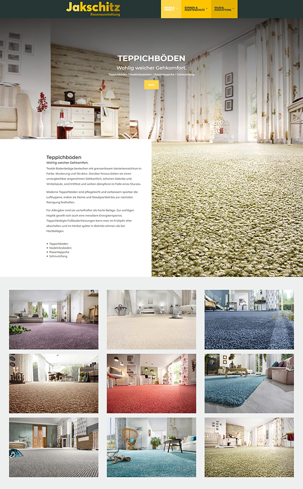
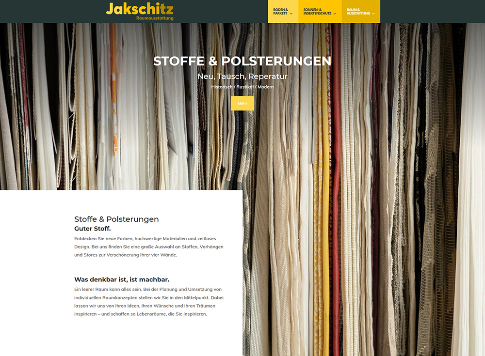
Responsive webdesign
In responsive web design, a website is graphically and technically designed to respond to the characteristics of each end device – smartphones and tablets.
The size and resolution of displays can vary considerably – the appearance and operation of a website are heavily dependent on the device used.
Responsive Webdesign provides a clear and user-friendly application with all end devices.
After 50 milliseconds, users make their judgment of a website. This is only half of the duration of a blinking eye. A clearly impressive proof of the importance of screen- / webdesign and usabillity on a website.
Works
iService projects in detail
Works in detail.


